As an educator, you make probably hundreds (maybe even thousands) of items a year. From tests to handouts to announcements, you are a one-person design department. It’s odd then that so few teaching programs include a design class.
Many people get design and art mixed up. Art includes design elements, and design CAN be artistic but they’re actually different. Design is another language that we communicate with.
Like spoken or written language there’s grammar and convention to design. That’s why designs look similar. They’re using common grammar to convey different messages. Just like other languages if you have never been taught how to speak and understand it, it’s easy to make mistakes.
As a busy educator you may not have all the time in the world to devote to learning all of design, so we’re going help by going over some mistakes we often see educators make and some tips to take your design to the next level!
All about fonts
The most common mistake educators make (especially, but not limited to, elementary school educators) is that more fonts = more fun.
(This design features 13 different fonts. It’s very hard for your eye to focus and then refocus on each one of them.)
Educators want to add emphasis or interest to an activity so they use a font for the title, another one for the headings, yet another for the questions and finally one for the page number.
This is really too much for the human eye. We thrive on consistency, it helps our brains guess what might come next. That aids in learning.
In most designs, you want no more than 2 fonts. A heading font, and a font for the smaller text is really the most you ever need.
The other thing to think about with fonts is legibility. Many of the fonts that are used for reasons of “fun” are not especially legible.
This can be frustrating for students who already struggle with reading or the English language. It can make the task far from fun, and instead irritating.
Legible fonts mainly are ones that are sans serif. That means they lack the little feet you often see on letters. Script fonts are also not very legible. Don’t forget many learners don’t even learn cursive anymore, and these fonts can be very frustrating to them.
Example:


This has a great list of very legible fonts you might like to use in your designs.
If you really want to take it to the next level and often use google to make your designs, the very best font to use is Atkinson Hyper Legible. It was developed to be maximally readable to people with visual impairments and those with learning disabilities. As an educator, you encounter both in your daily practice, so it makes for great universal design.
If you’d like to check out how it was developed (highly fascinating stuff!) you can do so here: Learn about how Atkinson Hyper Legible was developed.
In order to add emphasis or interest, rather than using a different font there are many other ways to do so. You can increase the font size, or the weight (make it bold or italics), or change the color. You can add dividing lines. All of these things will make your text standout, without adding additional, possibly less legible, fonts.
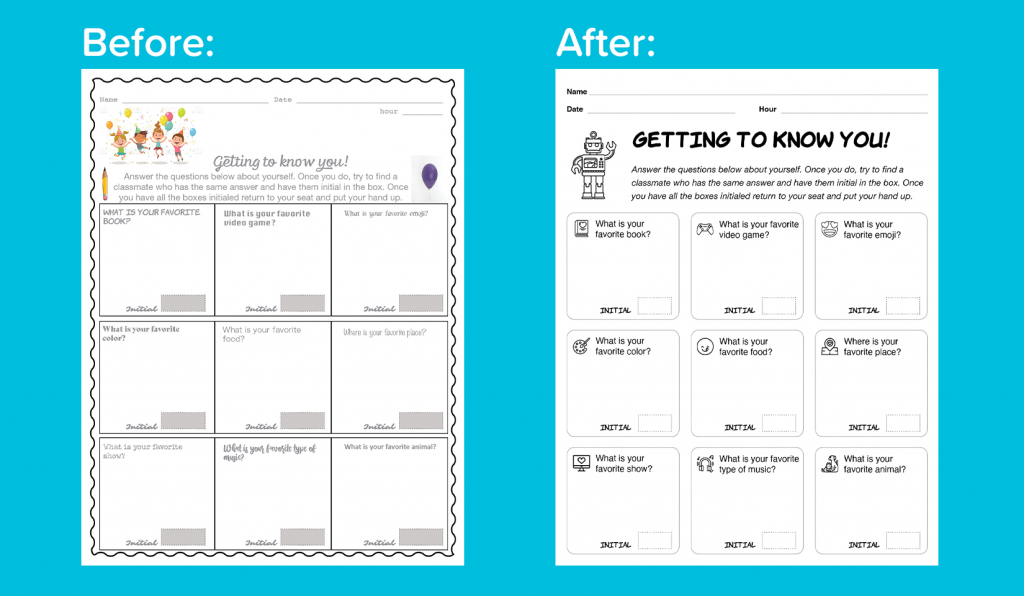
In this example 2 fonts were used, a “fun” font (Komika Hand, a comic book font) and a legible font (Helvetica).
Bold was used for the title to make it stick out more and for the heading to let students know it’s important to put their name, date and hour.
The “fun” font was also used on the boxes to make the place where initials go stand out from the questions. On the instructions italics were used to show they’re different from the questions. For the questions we used 14 point font instead of 12 so they’d be even easier to read.
Icons help with understanding
When you go out into the world, you see so many icons. Your brain might not even register them all.
There’s a reason that designers add icons. Icons help communicate information efficiently. Often they are faster at communicating than reading.
Using icons in your designs will have the same benefits. They can help students understand what to do without adding words. They can help to give a clue to help learners understand what is written on your page.
Icons are a little different than other forms of illustration because they are communicating a very specific thing not trying to convey a whole story.
Here at Azulita, we use a set of emojis as icons. They help students to know where they are and to understand what is being asked of them.
Icons can come in sets, like fonts. This helps for the same reason that using one font helps.
It makes them consistent and predictable. When using icons, try to pick one style (like all filled in or all outlined) to keep your designs clean and easy to use.
These icons are all lined, not filled. They also have similar lines on them.
Adding them makes it clear even without reading the question what is going to go in that box. It helps students pick quickly which one they want to start with and helps ELL and struggling reader students understand what the question is saying.
White space is your friend!
A trap I often see people fall into is not giving everything room to breathe. The places on a page not containing elements like text, icons and illustrations are called “white space”. White space is the super hero of design.
White space can help tell your eye where to go next. It also gives it a place to rest.
Placing too many elements too close together exhausts your eye. It makes it unclear what the most important thing on the page is. Basically too little white space is very confusing and frustrating.
If you find that your design is getting a little cluttered, it might be time for a second page or an edit. Maybe you don’t need that last question? Maybe that illustration doesn’t add much to the page? Editing is key for making your designs speak clearly.
Picking visual elements to delight and not frustrate
Photography and illustrations are great ways to help learners understand what you’re communicating.
There are good ways to use visual elements and … less good ways.
All of the elements of your design should be intentional. They should all be selected because they work together to communicate what you’re trying to help learners understand.
A boring design seems more exciting with illustrated borders and added illustrations, but this isn’t really the case. It’s got more going on, but again it very well may be killing the white space and choking out your written elements.
Like fonts and icons, select your photos, illustrations, borders and backgrounds thoughtfully. Make sure you’re picking them because they convey your message or illustrate points you’re making.
Images should never be an afterthought.
Also consider the cultural significance of the images. Try to make sure you’re using images as diverse as your learners. Think carefully about what different images can mean to different cultures when selecting one.
Always have a plan for where you’re putting your images and budget the white space they need around them as well.
The worst thing you can do is place an image in your composition just because the space looks empty or the overall piece is boring.
Design for neurodiversity and disabilities
As we’ve mentioned above there are a lot of ways to help make your compositions friendly to people with disabilities. Since, as an educator, you see many students with disabilities and neurodiversity, I thought I’d add a few specific tips.
Make sure you have sufficient contrast. But what does that mean? Contrast is how much one element stands out from one another.
The classic in contrast is black on white. This is the most legible by far, however it is also the most standard.
You can certainly branch out and use other colors, but keep in mind their contrast. You can test the contrast here. You want a ratio of at least 4.5:1.
If you don’t really want to check all of the time, this resource has a bunch of color pairings which meet accessibility guidelines.
If a photo or image is included in your design and being able to view it is necessary for a learner to understand a question or concept, create a version with a description of the image instead for low vision learners.
You could even include a version with both the image and the description. This is even becoming popular on social media sites (image descriptions for screen readers, etc.). We don’t always know what someone might prefer and if it helps that’s wonderful!
If you’re using color, pick a palette of no more than 3-5 colors. This will help students with attention issues, as too many colors can be overwhelming and confusing.
Take it slow and do what you’re comfortable doing
That may have been a lot. Design is a discipline that people spend their lives perfecting. No one expects you to do all of this over night.
Pick a tip that seems doable, and practice it. Once that feels good and natural, add another.
Over time you’ll become as amazing at designing your materials as you are at teaching them!
Here’s our final product after applying all of the design elements:
Additional Resources:
https://www.pexels.com Free, high quality photography and even video snippets!
https://www.vecteezy.com Free, high quality illustrations and icons
https://thenounproject.com Free high quality icons for literally all use cases
https://www.peachpit.com/store/non-designers-design-book-9780133966152 This book is great for going over the basic design principles and how to use them in your materials
https://brailleinstitute.org/freefont You can also download Atkinson Hyperlegible for your Mac or PC here.
https://www.wacom.com/en-cl/discover/design/graphic-design If you have no time for a book but want a basic primer on the elements of design, this blog is a VERY quick and handy guide